UI/UX (Web Platform)
This spans a fully interactive website and core operational screens. The work combines UX research, interaction design, UI, motion, and illustration to create a clear, engaging experience from first entry through day-to-day use.
Year :
2026
Industry :
SaaS/B2B
Client :
Flowra
Project Duration :
3-week focused design sprint

PROJECT OVERVIEW
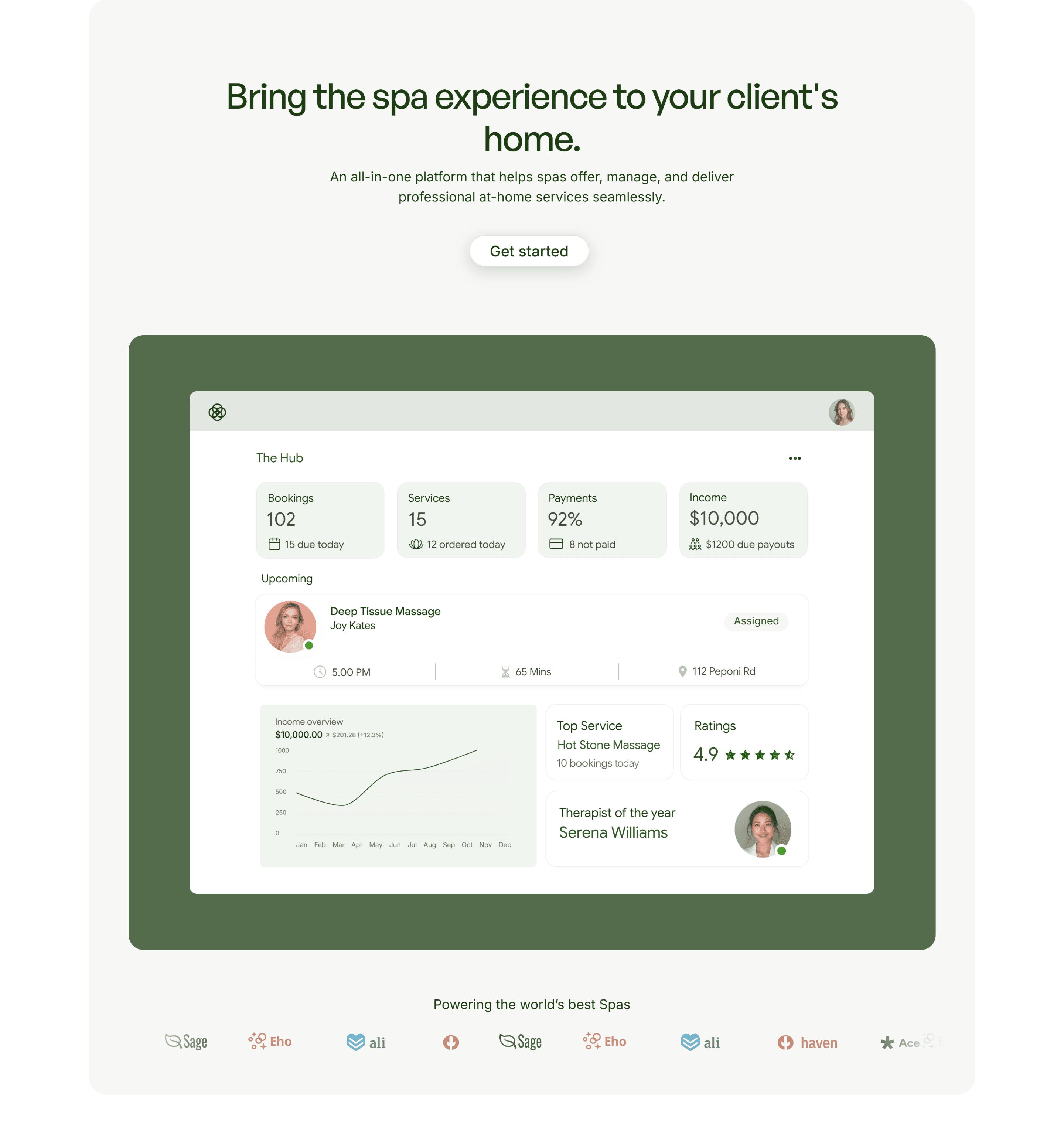
Designed an end-to-end platform (marketing website + internal system) to support spa operators in managing at-home services, focusing on clarity, ease of use, and reducing operational friction.
The work combined user research, journey mapping, and interface design to create a cohesive experience that supports both first-time users and daily operational workflows.
PROBLEM FRAMING
Many spa operators struggle with fragmented tools to manage bookings, payments, and services, leading to inefficiencies and errors in daily operations.
Additionally, first-time users often face difficulty understanding how such platforms fit into their workflow, creating a barrier to adoption.
The challenge was to design an experience that:
"Clearly communicates value upfront"
"Reduces cognitive load for new users"
"Supports efficient day-to-day task completion"
USER UNDERSTANDING
To understand user needs, I analyzed expected user behavior, focusing on:
"Service providers managing multiple bookings"
"Users needing quick access to key actions (bookings, payments, schedules)"
"Users with limited time and low tolerance for complex interfaces"
This helped identify key pain points:
"Overloaded dashboards"
"Unclear navigation"
"Difficulty tracking bookings and payments"

JOURNEY AND SYSTEM THINKING
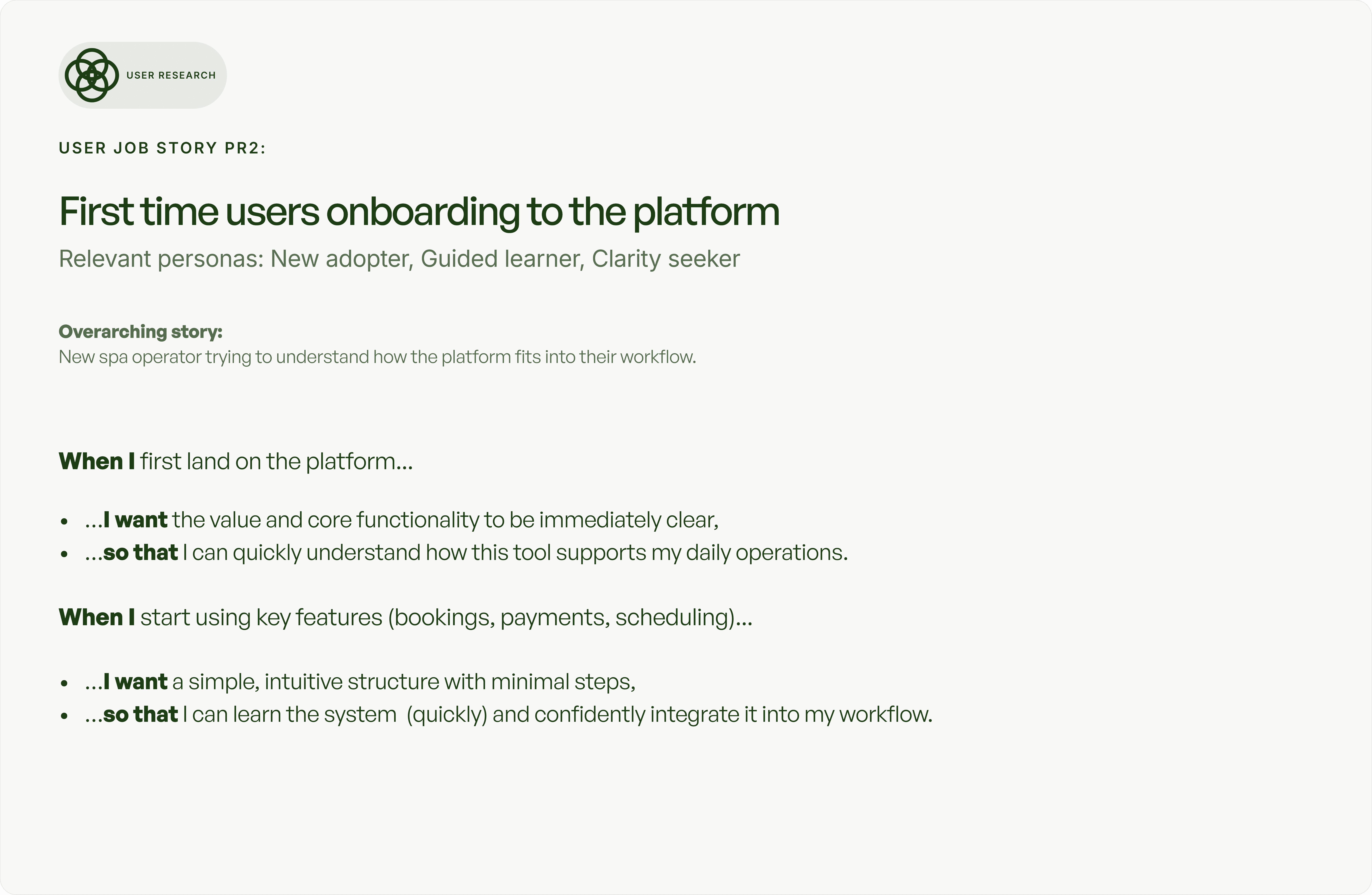
I mapped the user journey across two key phases:
1. Entry & Understanding (Website)
Users need to quickly understand what the platform does and how it fits into their workflow.
2. Daily Operations (Internal System)
Users need to efficiently manage bookings, payments, and services with minimal friction.
Designing both parts together ensured a seamless transition from discovery to active use.

DESIGN DECISIONS
I designed the experience with a strong focus on clarity, usability, and reducing cognitive load:
"Structured content progressively to help users understand the platform step-by-step"
"Designed clear navigation and predictable interaction patterns to reduce confusion"
"Prioritized key actions (bookings, payments, tracking) for quick access"
"Used spacing, hierarchy, and visual cues to guide attention and improve readability"
"Ensured consistency across screens through reusable patterns and components"
These decisions helped create a calm but highly functional experience that supports both learning and efficiency.


INTERNAL SYSTEM
The internal system was designed to support high-frequency tasks:
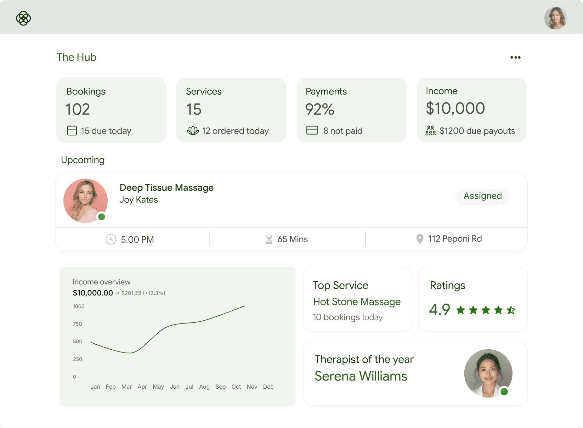
"Central dashboard for managing bookings, services, and payments"
"Clear data hierarchy to reduce errors and improve task completion"
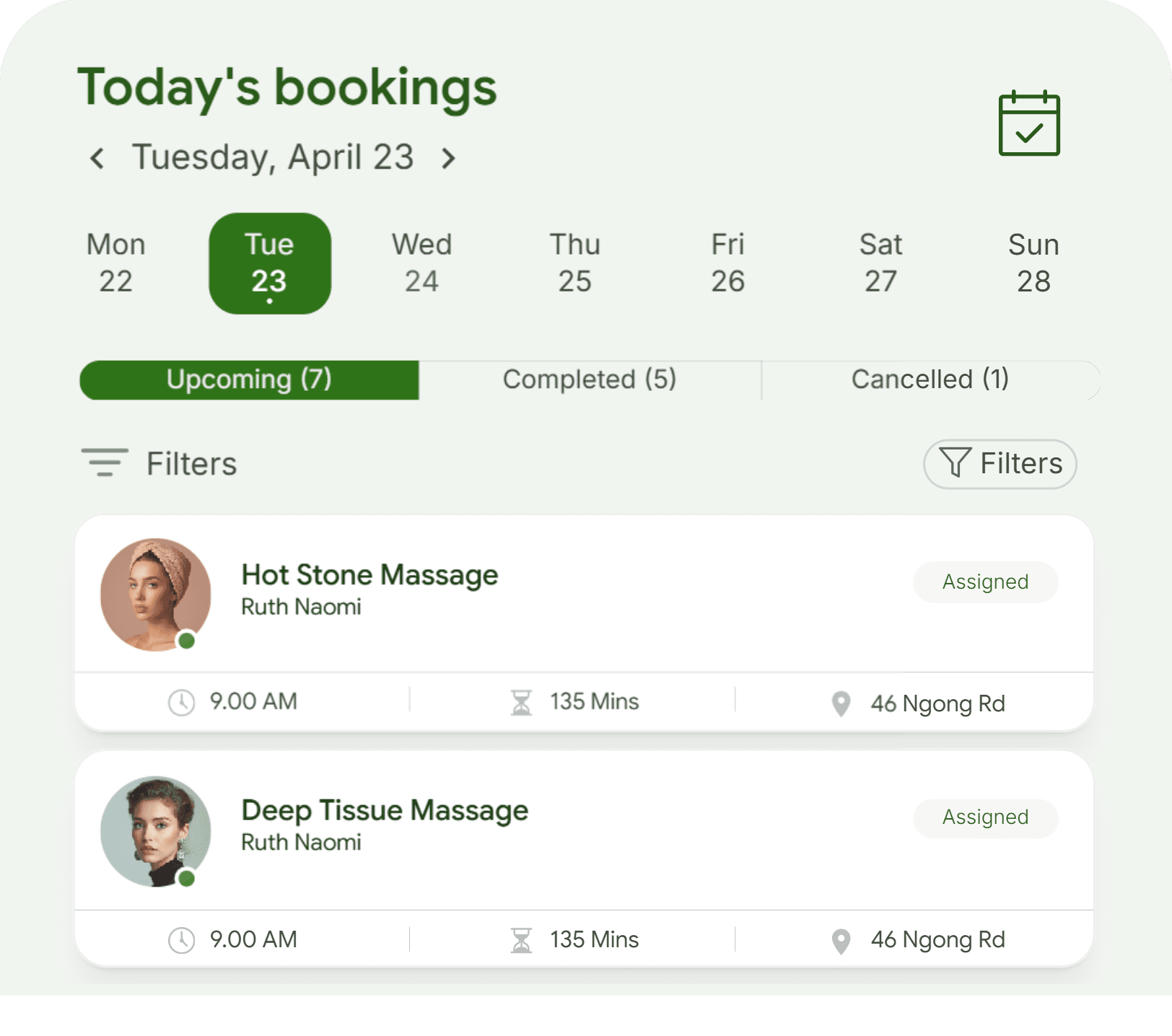
"Simplified workflows for tracking and updating bookings"
THE OPERATIONAL FLOW LOGIC (Dashboard → Actions → System Response)
View dashboard → shows bookings, services, and payment statuses
Select a booking → reveals details and available actions (confirm/reschedule)
Customer completes payment → system automatically updates payment status
Updated status reflects across the dashboard in real time
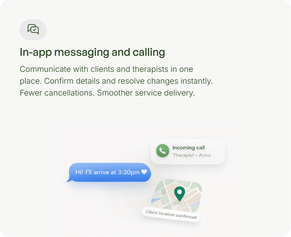
I mapped key operational flows to ensure spa operators could monitor bookings and payments in real time, with system-driven updates reducing the need for manual input.
ACCESSIBILITY AND REAL-WORLD USE
The experience was designed to remain clear and usable across different user contexts by:
"Keeping interfaces lightweight and easy to navigate"
"Reducing reliance on complex interactions"
"Prioritizing readability and clear visual hierarchy"
Designing for real-world usage required defining clear component behaviors across different states.
IMPACT
Outcome & Impact
"Improved clarity of the platform’s value proposition"
"Reduced complexity in navigation and task flows"
"Created a scalable foundation for future product expansion"
The design approach focused on long-term usability, consistency, and ease of adoption.
What I learnt
Keeping things simple really matters than adding more features. Too much information or too many options can quickly overwhelm users.
Breaking down the full workflow helped reduce that overload and turn a complex process into something clear and easy to use.